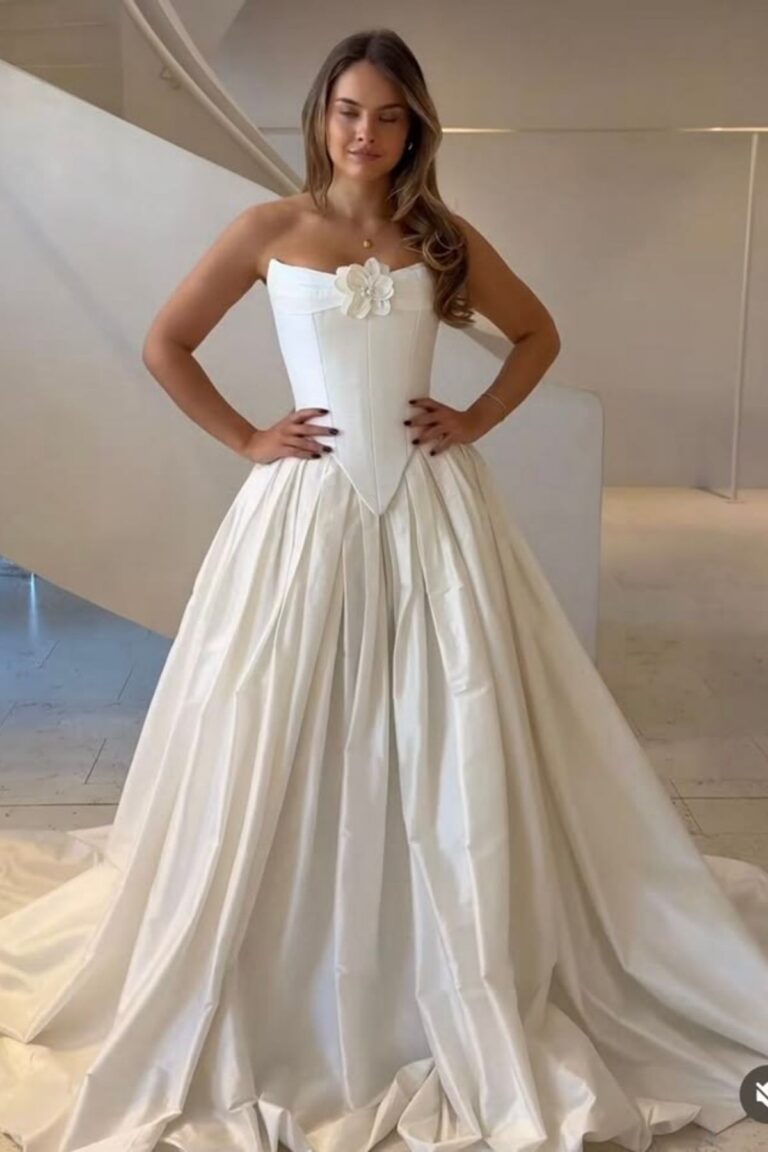

50 Wedding Color Palettes That Never Go Out of Style
Disclosure: Some of the links in this post are affiliate links. This means if you click on the link and purchase an item, I will receive an affiliate commission at no extra cost to you.
Choosing wedding colors can feel exciting until you discover hundreds of beautiful combinations online. The right wedding color palettes help create a celebration that feels personal, welcoming, and timeless.
Your colors will appear in photographs, flowers, invitations, bridesmaid dresses, table settings, and other memorable details. Let’s explore 50 Wedding Color Palettes That Never Go Out of Style, with inspiration for different venues, seasons, and budgets.
50 Wedding Color Palettes That Never Go Out of Style
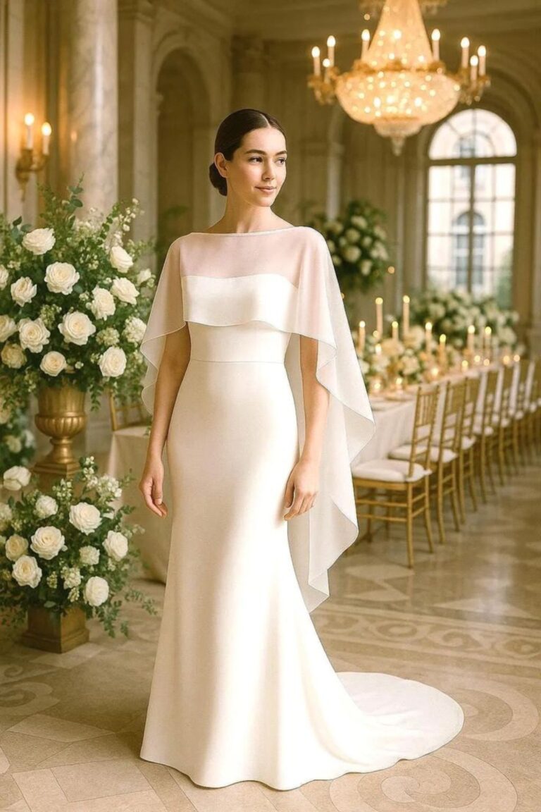
1. White and Ivory
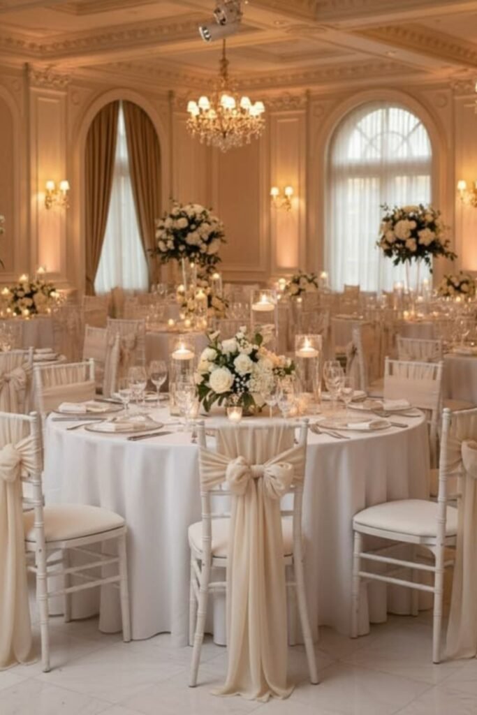
White and ivory create a timeless combination that feels elegant without demanding attention.
These wedding color palettes work beautifully in traditional churches, outdoor gardens, and sophisticated hotel venues.
White flowers bring freshness, while ivory linens introduce warmth and softness.
Consider white roses, ivory tablecloths, and creamy stationery for a cohesive appearance. Gold candleholders can add subtle elegance without overwhelming the arrangement.
This combination also photographs beautifully because the shades complement many wedding styles.
Couples can keep everything minimal or introduce different textures through flowers, fabrics, and tableware.
2. Blush Pink and Ivory
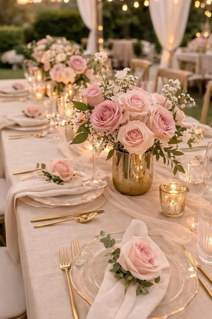
Blush pink and ivory create a romantic atmosphere that feels gentle, graceful, and inviting.
These wedding color palettes suit garden weddings, historic venues, and intimate celebrations with soft lighting.
Blush roses, ivory linens, and delicate pink stationery can bring everything together naturally.
For bridesmaid dresses, choose dusty blush instead of bright pink for a more understated appearance.
Add ivory candles and champagne-colored accessories to introduce warmth without creating visual clutter.
This combination works particularly well during spring and summer, although richer fabrics make it suitable for cooler months. It offers romance without making the celebration feel overly sweet.
3. Navy Blue and White
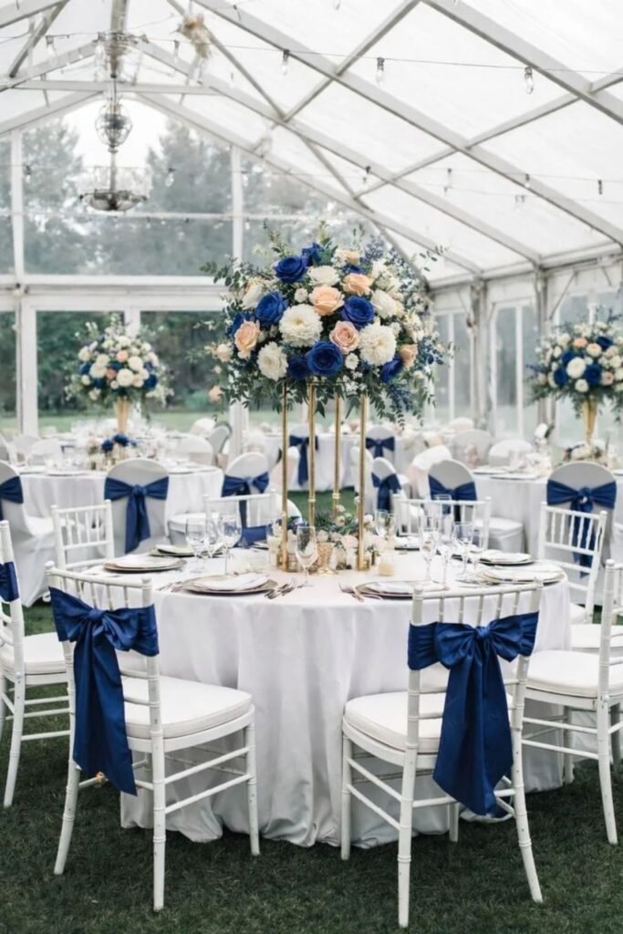
Navy blue and white provide crisp contrast that feels polished and consistently stylish.
This combination suits formal ballroom receptions, coastal weddings, and elegant evening celebrations.
Navy bridesmaid dresses look striking beside white bouquets, while white linens help darker details stand out.
Use navy stationery, white floral arrangements, and simple silver accessories for a coordinated appearance.
Couples can introduce navy napkins or table runners without covering every surface in color. This approach keeps the reception feeling balanced rather than overly dark.
Navy and white also photograph beautifully across different lighting conditions, making them dependable wedding color palettes for traditional and contemporary celebrations.
4. Sage Green and Ivory
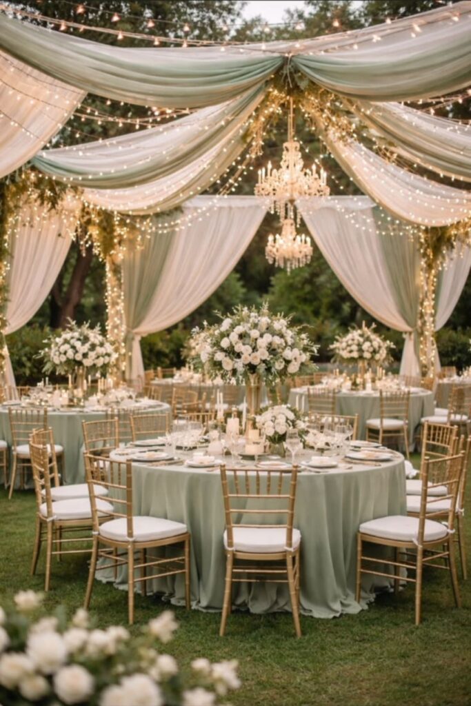
Sage green and ivory bring a calm, natural feeling to wedding celebrations.
Their muted tones complement outdoor venues, rustic barns, garden ceremonies, and relaxed countryside receptions.
Sage bridesmaid dresses pair beautifully with ivory bouquets and greenery-filled centerpieces.
Consider ivory tablecloths, sage napkins, and foliage arranged along reception tables. Wooden chairs and woven textures can strengthen the natural appearance without requiring expensive decorations.
This combination works throughout the year, especially when seasonal flowers introduce additional interest.
Couples who appreciate understated elegance will find these wedding color palettes easy to incorporate into invitations, attire, floral arrangements, and reception details.
5. Black and White

Black and white remain among the most dependable wedding color palettes for couples who appreciate clean, dramatic styling.
The contrast feels sophisticated without relying on fashionable shades that might quickly lose their appeal. Black suits, white flowers, and crisp linens create an effortlessly coordinated appearance.
For reception decor, consider black menus, white tablecloths, and simple monochrome stationery.
Crystal glassware can introduce sparkle, while candles soften the overall atmosphere. Couples can also choose a black-and-white dance floor for a striking focal point.
This combination suits modern venues, formal evening receptions, and historic buildings with distinctive architectural details.
6. Dusty Blue and Champagne
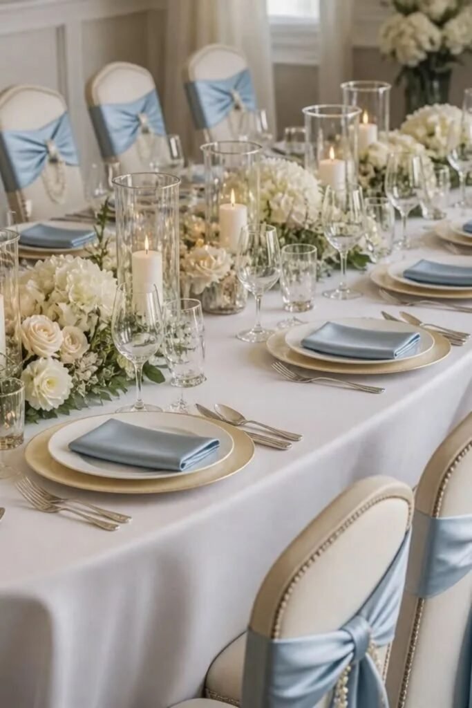
Dusty blue and champagne create a soft combination that feels refined without becoming overly formal.
The muted blue introduces coolness, while champagne adds warmth and a gentle golden glow. These wedding color palettes suit garden ceremonies, elegant estates, and outdoor receptions.
Consider dusty blue bridesmaid dresses, champagne linens, and white flowers with delicate greenery.
Champagne-colored candles can make reception tables feel warmer after sunset. For stationery, use dusty blue backgrounds with champagne lettering or subtle metallic details.
This combination works especially well during spring, summer, and early autumn, although heavier fabrics can make it suitable for winter celebrations.
7. Burgundy and Blush Pink
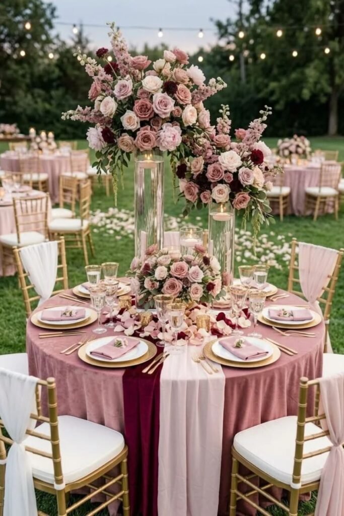
Burgundy and blush pink balance richness with softness, creating a romantic palette with plenty of depth.
Burgundy introduces a dramatic touch, while blush prevents the overall appearance from feeling too heavy.
These wedding color palettes work especially well for autumn celebrations and elegant evening receptions.
Choose burgundy bridesmaid dresses, blush roses, and ivory accents for a balanced arrangement.
Burgundy napkins or menus can carry the deeper shade into reception decor. Couples can also incorporate gold candleholders for additional warmth.
This combination suits vineyards, historic estates, and candlelit venues where deeper colors feel especially inviting.
8. Emerald Green and Gold
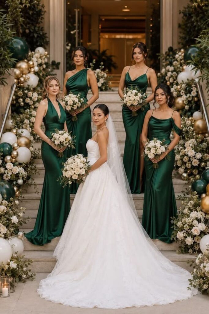
Emerald green and gold create a luxurious appearance that feels classic rather than excessive.
Deep green brings richness, while gold introduces warmth through metallic details and decorative accents.
These wedding color palettes suit formal ballrooms, grand hotels, and celebrations with traditional styling.
Use emerald table runners, gold candleholders, and white floral arrangements to keep the colors balanced.
Emerald bridesmaid dresses can also complement gold jewelry and understated bouquets.
Couples do not need expensive decorations to achieve this effect, since a few carefully placed metallic accents can make a noticeable difference.
The combination works beautifully during autumn and winter, although lighter fabrics suit warmer seasons.
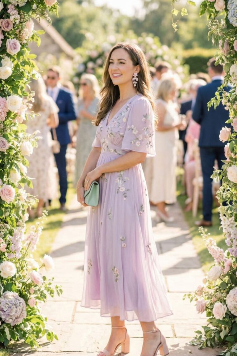
9. Lavender and Ivory
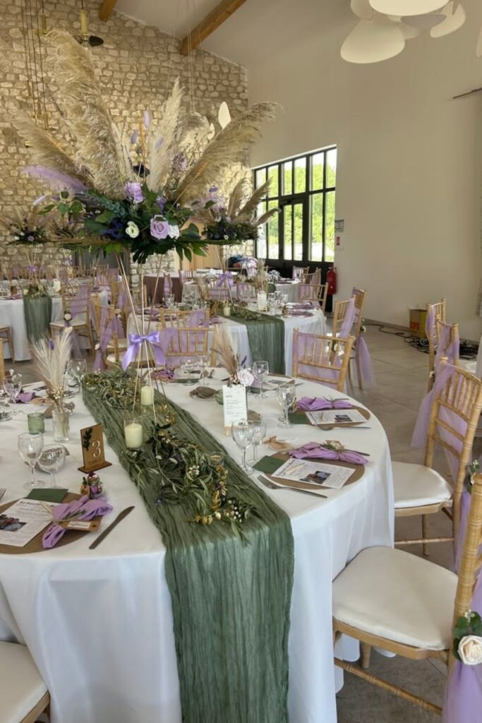
Lavender and ivory create a gentle, romantic appearance that feels especially inviting during spring weddings.
Lavender introduces a delicate touch of color, while ivory keeps the overall design soft and elegant.
These wedding color palettes complement garden venues, outdoor ceremonies, and intimate receptions.
Consider lavender bouquets, ivory tablecloths, and pale purple stationery. Fresh lavender stems can also decorate place settings or accompany simple floral centerpieces.
For bridesmaid dresses, muted lavender offers a graceful alternative to brighter purple shades. Add greenery or soft silver accents when the arrangement needs more definition.
This palette feels charming without requiring elaborate decorations or expensive floral installations.
10. Dusty Rose and Grey
Dusty rose and grey combine romantic warmth with understated sophistication.
The pink adds softness, while grey creates a neutral foundation that keeps the overall design balanced.
These wedding color palettes work well in modern hotels, garden venues, and elegant indoor receptions.
Choose dusty rose flowers, grey suits, and ivory linens to create a coordinated appearance.
Grey napkins or table runners can provide subtle contrast without competing with the flowers. Silver accessories also complement this combination naturally.
Couples planning autumn or winter weddings can introduce deeper grey shades, while lighter versions feel appropriate for spring celebrations.
The result feels polished, comfortable, and easy to personalize.
11. Coral and Ivory
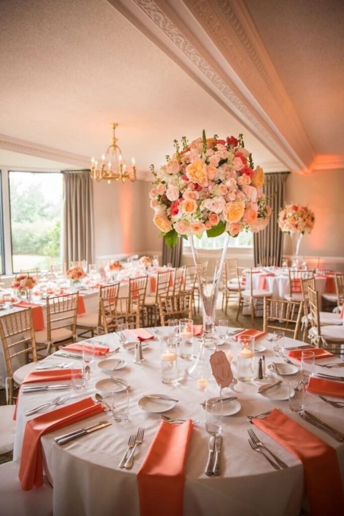
Coral and ivory create a cheerful combination that feels fresh without becoming overwhelming.
Coral adds warmth and energy, while ivory softens the brighter shade and creates visual balance.
These wedding color palettes suit beach ceremonies, garden receptions, and outdoor celebrations during warmer months.
Consider coral roses, ivory table linens, and greenery-filled centerpieces. Coral bridesmaid dresses can also bring color into wedding photographs without requiring elaborate decorations.
For reception tables, use coral napkins alongside neutral plates and glassware.
This combination looks especially appealing in natural daylight, where its warm tones complement outdoor surroundings.
Couples can introduce champagne accents for a slightly more formal appearance.
12. Peach and Sage Green
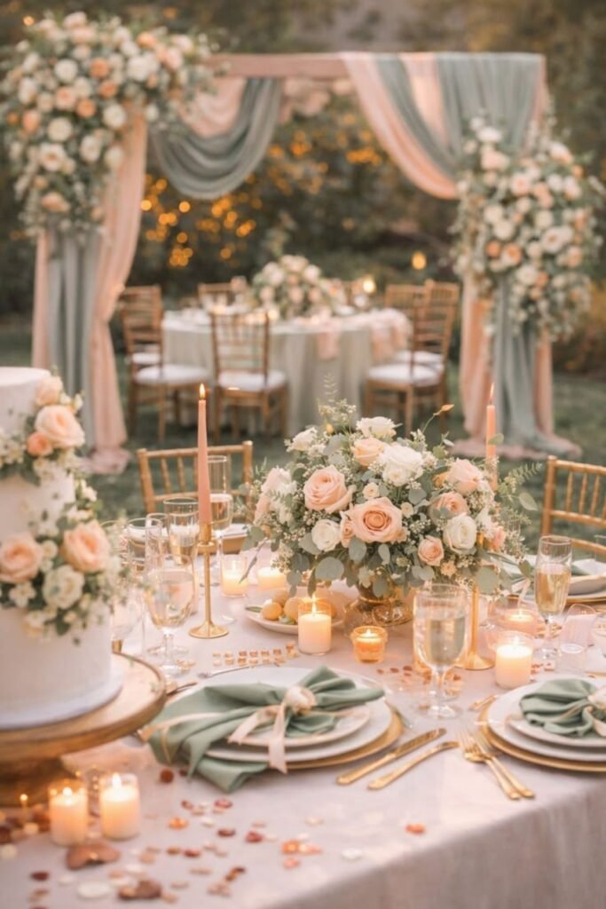
Peach and sage green bring together two natural shades that feel relaxed, warm, and inviting.
Peach introduces a gentle glow, while sage provides a calming foundation. These wedding color palettes suit garden ceremonies, rustic venues, and romantic outdoor receptions.
Choose peach flowers, sage napkins, and ivory linens for a balanced arrangement.
Wooden tables and simple glass vases can strengthen the natural appearance without adding unnecessary expense.
Peach bridesmaid dresses also pair beautifully with bouquets containing greenery and cream-colored flowers.
This combination works particularly well during spring and summer, although deeper peach tones can complement early autumn celebrations.
13. Red and Ivory
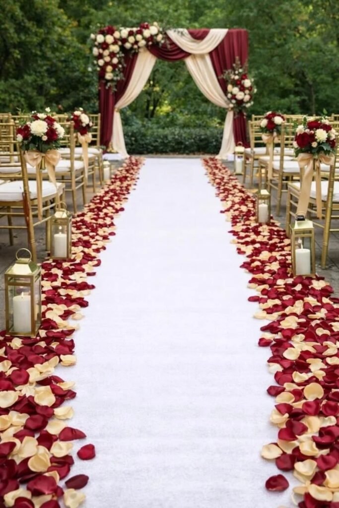
Red and ivory create a classic combination that feels romantic, confident, and memorable. Red introduces a strong focal point, while ivory keeps the overall appearance elegant and balanced.
These wedding color palettes suit traditional ceremonies, formal receptions, and celebrations that embrace rich color.
Consider red roses, ivory linens, and restrained red accents throughout the reception space. White candles can soften the arrangement, while gold details introduce additional warmth.
Couples can also incorporate red into stationery, bouquets, or bridesmaid accessories rather than using it everywhere.
This approach creates visual interest without making the venue feel crowded. The palette works year-round, particularly during winter celebrations.
14. Powder Blue and White
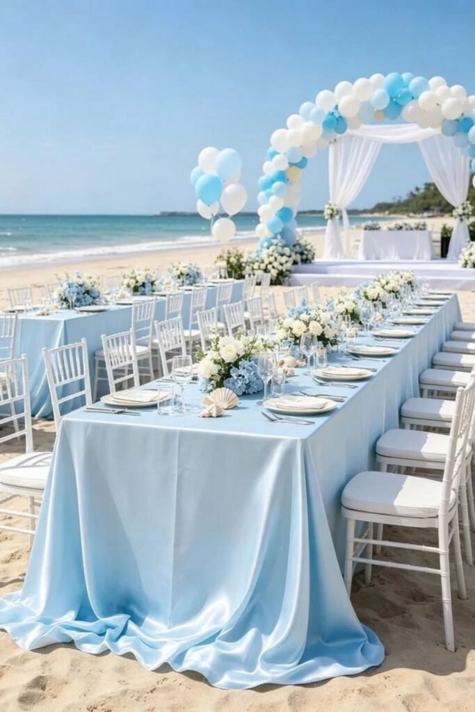
Powder blue and white create an airy combination that feels peaceful, graceful, and timeless. The pale blue introduces gentle color, while white keeps the overall appearance fresh and bright.
These wedding color palettes suit coastal venues, garden ceremonies, and elegant daytime receptions.
Choose powder blue bridesmaid dresses, white flowers, and crisp table linens for a coordinated appearance.
Blue glassware or delicate ribbons can introduce the color without requiring extensive decorations.
Silver accents also complement this combination beautifully.
During summer, the palette feels light and refreshing, while winter weddings can use richer blue accessories for added depth. It remains a lovely option for couples who prefer understated elegance.
15. Plum and Champagne
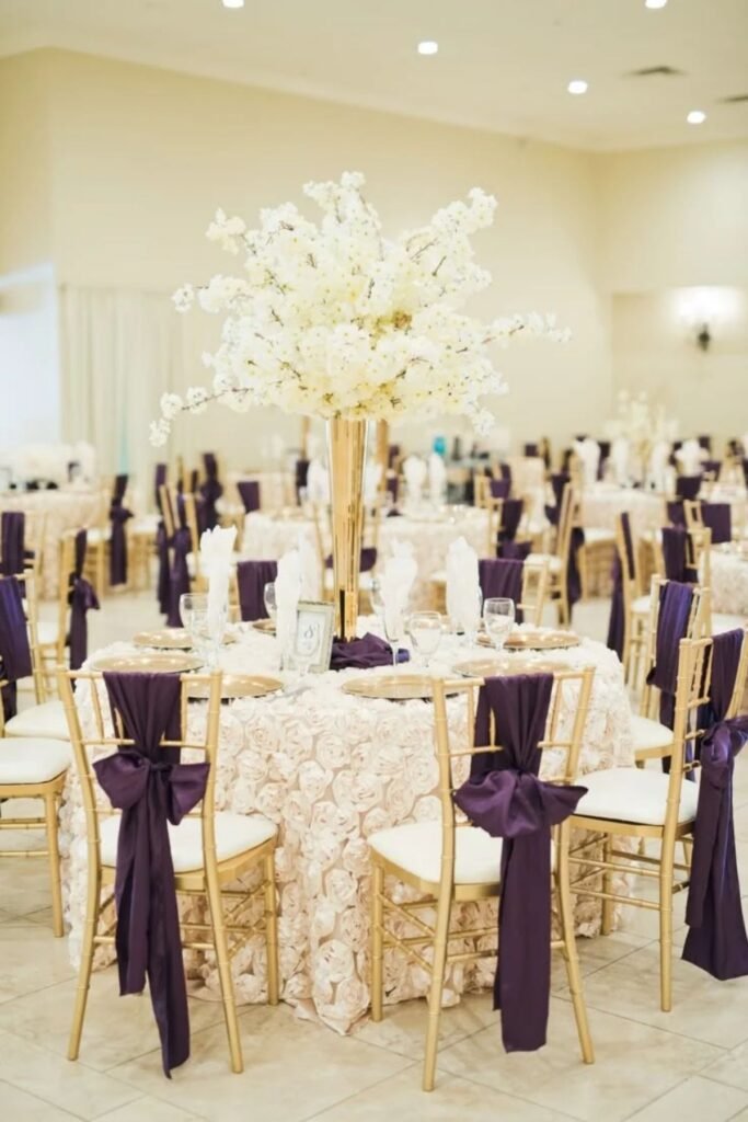
Plum and champagne combine rich color with warm, understated elegance. Plum adds depth and character, while champagne softens the overall appearance with a subtle golden tone.
These wedding color palettes work beautifully in historic venues, formal ballrooms, and intimate evening receptions.
Consider plum bridesmaid dresses, champagne linens, and ivory flowers with touches of greenery.
Gold candleholders can introduce additional warmth without competing with the deeper shade.
Couples may also use plum stationery or table napkins to connect the colors throughout the venue.
This combination feels especially suitable for autumn and winter, although lighter fabrics can make it comfortable for spring celebrations.
16. Terracotta and Cream
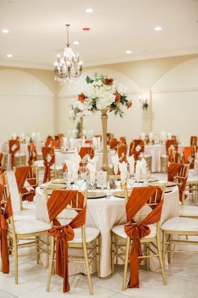
Terracotta and cream create an earthy combination inspired by clay, sunlit landscapes, and natural materials.
Terracotta adds warmth, while cream keeps the design soft and inviting. These wedding color palettes suit desert venues, rustic barns, outdoor celebrations, and relaxed countryside receptions.
Use terracotta napkins, cream tablecloths, and dried floral arrangements for a cohesive appearance.
Wooden chairs, ceramic vases, and woven details can strengthen the natural style. Couples can also introduce terracotta bridesmaid dresses for a richer visual effect.
This palette works especially well during late summer and autumn, although neutral fabrics help it feel comfortable throughout the year.
17. Forest Green and Ivory
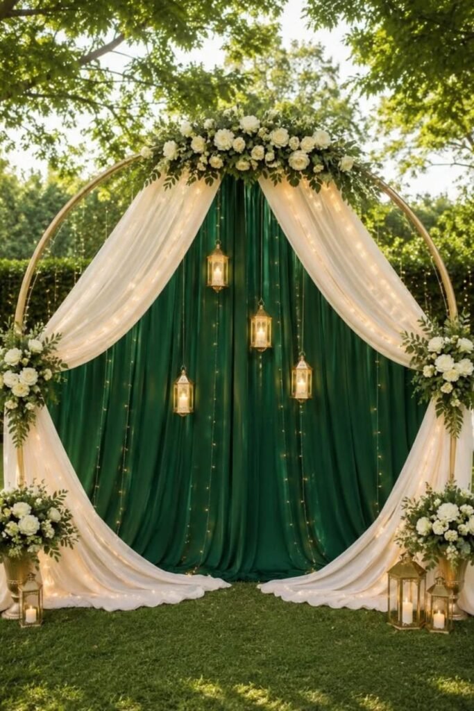
Forest green and ivory create a grounded, elegant combination that feels connected to nature. The deep green adds richness, while ivory introduces softness and contrast.
These wedding color palettes suit woodland ceremonies, historic estates, garden receptions, and formal indoor celebrations.
Consider forest green bridesmaid dresses, ivory roses, and foliage-filled centerpieces.
Ivory table linens can brighten darker reception spaces, while green napkins introduce color without overwhelming the tables. Wooden accents and gold accessories can add warmth when needed.
This combination works across all seasons, with evergreen foliage providing an especially natural look during autumn and winter. It offers timeless styling without depending on elaborate decorations.
18. Champagne and White
Champagne and white create an elegant combination that feels bright, graceful, and welcoming.
Champagne adds a gentle golden warmth, while white keeps the overall appearance clean and timeless.
These wedding color palettes suit formal ballrooms, luxury hotels, garden ceremonies, and classic church weddings.
Consider champagne bridesmaid dresses, white roses, and crisp white linens for a coordinated look.
Gold-rimmed glassware and delicate candleholders can introduce subtle detail without making the tables feel crowded. Champagne ribbons also work beautifully on bouquets and invitations.
This combination suits every season, making it a dependable choice for couples who want understated elegance throughout their celebration.
19. Mauve and Grey
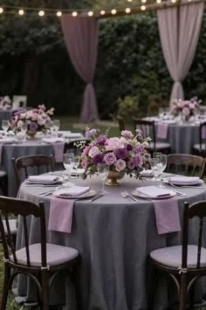
Mauve and grey offer a sophisticated blend of muted color and neutral simplicity. Mauve introduces a soft purple-pink tone, while grey creates balance and prevents the palette from feeling overly sweet.
These wedding color palettes work beautifully in garden venues, historic buildings, and intimate indoor receptions.
Choose mauve bridesmaid dresses, grey suits, and ivory flowers for a cohesive appearance. Grey table runners can complement mauve napkins, while silver accessories add a polished finishing touch.
This combination suits autumn and winter weddings particularly well, although lighter shades feel lovely during spring.
Couples can also incorporate mauve into stationery and floral arrangements, creating consistency without repeating the same color everywhere.
20. Teal and Gold
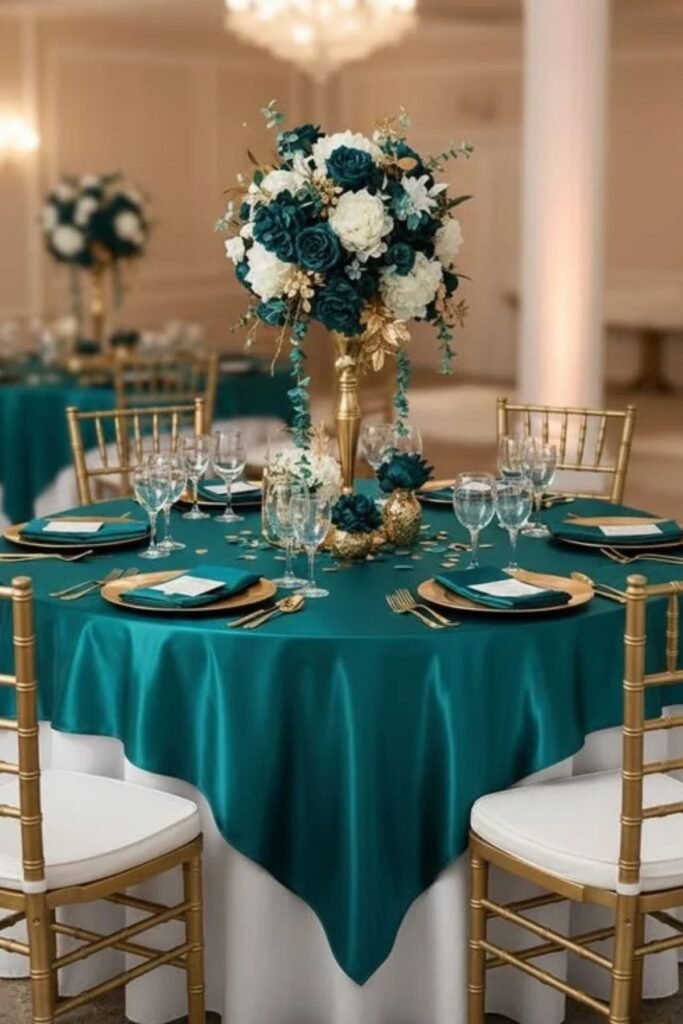
Teal and gold combine rich color with warm metallic details, creating a celebration that feels elegant and memorable. Teal brings depth, while gold adds brightness and a touch of glamour.
These wedding color palettes suit evening receptions, formal ballrooms, and distinctive indoor venues.
Consider teal bridesmaid dresses, gold candleholders, and ivory floral arrangements. Teal napkins can introduce color across reception tables without overwhelming the space.
Gold stationery details or place cards can connect the theme throughout the celebration. For a balanced appearance, keep the metallic accents restrained and allow teal to remain the main color.
This combination works especially well during autumn and winter, although lighter teal shades suit warmer months.
21. Yellow and White
Yellow and white create a cheerful combination that feels bright, fresh, and welcoming. Yellow introduces warmth and optimism, while white prevents the overall design from becoming too intense.
These wedding color palettes suit summer garden ceremonies, outdoor receptions, and relaxed celebrations filled with natural light.
Choose yellow flowers, white tablecloths, and simple glass vases for a sunny reception design. White bridesmaid dresses with yellow bouquets can also create beautiful photographs.
Couples who prefer subtle color can use pale yellow napkins or stationery instead of covering every table with bright shades.
Green foliage complements this combination naturally, adding depth while keeping the atmosphere light and comfortable.
22. Olive Green and Cream
Olive green and cream create a natural, understated combination that feels warm and effortlessly elegant.
Olive brings earthy depth, while cream introduces softness without the stark contrast of pure white.
These wedding color palettes suit vineyard celebrations, rustic barns, garden ceremonies, and countryside venues.
Use olive napkins, cream tablecloths, and greenery-filled floral arrangements to create a cohesive appearance.
Ceramic vases and wooden chairs can strengthen the natural style without requiring expensive decorations. Olive bridesmaid dresses also pair beautifully with cream bouquets and gold accessories.
This combination works throughout the year, although it feels particularly inviting during autumn. Couples can introduce seasonal flowers while keeping the main colors consistent.
23. Sky Blue and Peach
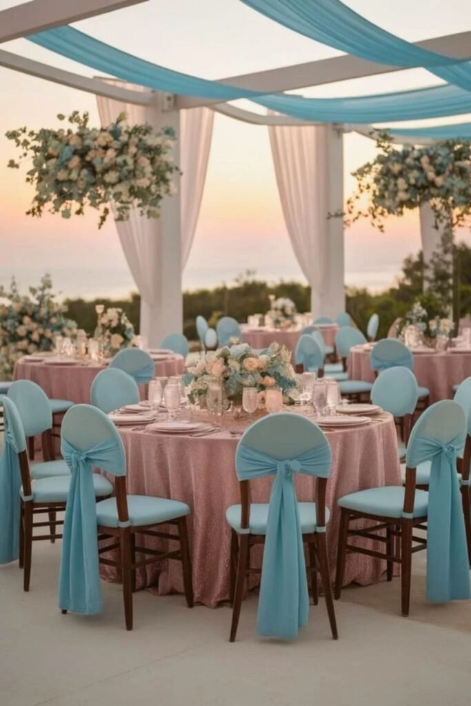
Sky blue and peach create a refreshing combination that balances coolness with gentle warmth. Blue adds an airy quality, while peach introduces a soft, romantic glow.
These wedding color palettes work especially well for spring ceremonies, summer garden receptions, and outdoor celebrations.
Consider sky blue bridesmaid dresses, peach flowers, and ivory table linens.
Peach napkins can introduce warmth across reception tables, while blue stationery connects the colors throughout the event.
Couples can also use delicate ribbons or colored glassware for subtle accents. Keep the brighter elements balanced with neutral details, allowing both shades to stand out naturally.
This combination feels relaxed and cheerful without sacrificing elegance.
24. Chocolate Brown and Ivory
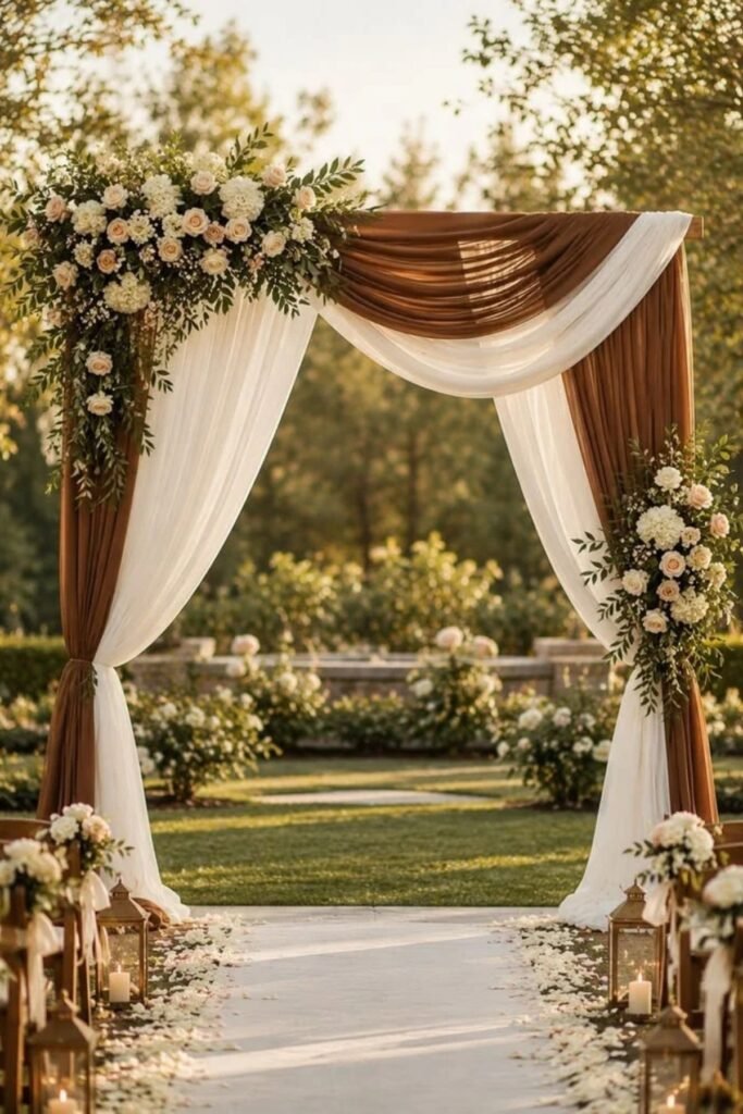
Chocolate brown and ivory create a warm, classic combination with plenty of natural depth. Brown adds richness, while ivory keeps the overall appearance light and sophisticated.
These wedding color palettes suit autumn celebrations, rustic venues, elegant estates, and intimate indoor receptions.
Choose chocolate brown suits, ivory flowers, and cream-colored table linens for a balanced design.
Brown ribbons, stationery, or napkins can carry the deeper shade throughout the venue. Wooden furniture and candlelight also complement the palette beautifully.
Couples can introduce champagne accents when they want a slightly more formal appearance.
This combination offers a comfortable alternative to black and white, particularly for celebrations with warm lighting and natural materials.
25. Rose Gold and Blush
Rose gold and blush create a romantic combination that feels soft, warm, and polished. Blush provides a delicate pink foundation, while rose gold introduces a subtle metallic glow.
These wedding color palettes suit ballroom receptions, garden weddings, and elegant celebrations with romantic styling.
Consider blush bridesmaid dresses, rose gold candleholders, and ivory roses. Rose gold details can also appear on invitations, table numbers, and decorative accessories.
To avoid an overly shiny appearance, balance metallic elements with soft fabrics and natural flowers.
This combination works beautifully during spring and summer, although candlelight makes it especially inviting during winter receptions.
26. Midnight Blue and Silver
Midnight blue and silver create a striking combination suited to formal celebrations and elegant evening receptions.
The deep blue introduces drama, while silver adds brightness and a refined metallic finish.
These wedding color palettes work particularly well in ballrooms, modern hotels, and winter wedding venues.
Choose midnight blue bridesmaid dresses, silver candleholders, and white floral arrangements. Silver stationery details can complement blue table runners, creating consistency across the reception.
Crystal glassware also reflects light beautifully, helping darker settings feel brighter. Couples should balance the deeper shade with white or ivory elements, especially in smaller venues.
This combination feels classic and polished without relying on bright or fashionable colors.
27. Peach and Ivory
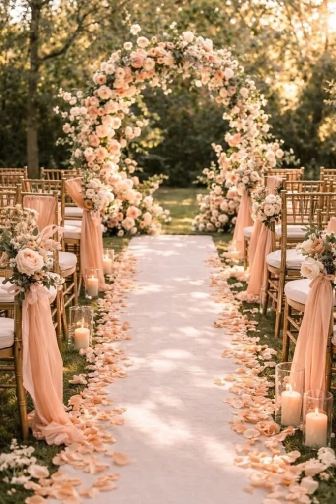
Peach and ivory create a gentle combination that feels romantic, welcoming, and naturally elegant. Peach adds warmth, while ivory keeps the overall design soft and balanced.
These wedding color palettes suit garden ceremonies, outdoor receptions, and intimate celebrations during spring or summer.
Choose peach roses, ivory tablecloths, and simple floral centerpieces for a cohesive appearance.
Peach bridesmaid dresses can complement neutral suits and cream-colored bouquets. For reception details, consider peach napkins, ivory candles, and understated stationery.
Green foliage adds contrast without competing with the delicate colors.
Couples can also introduce champagne accents for extra warmth, creating a timeless style that feels comfortable rather than overly formal.
28. Cobalt Blue and White
Cobalt blue and white create a crisp combination with a confident, classic appearance. The vivid blue introduces energy, while white keeps the design balanced and fresh.
These wedding color palettes suit coastal celebrations, modern venues, and summer receptions with bright natural lighting.
Consider cobalt blue bridesmaid dresses, white roses, and clean white table linens. Blue glassware or patterned stationery can introduce additional interest without overcrowding the reception space.
Couples can also use cobalt ribbons on bouquets or invitations for a coordinated finish.
Since cobalt makes a strong visual statement, smaller accents may work better than using it across every decorative element. The result feels polished, cheerful, and memorable.
29. Burgundy and Gold
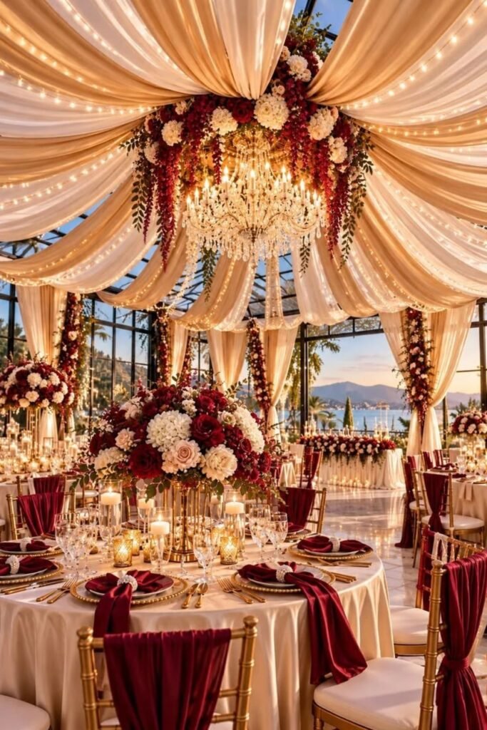
Burgundy and gold create a rich combination that feels romantic, dramatic, and timeless. Burgundy brings depth, while gold adds warmth and a luxurious finish.
These wedding color palettes suit autumn receptions, winter celebrations, historic estates, and formal evening venues.
Choose burgundy flowers, gold candleholders, and ivory table linens to balance the stronger colors.
Burgundy bridesmaid dresses can also complement gold accessories and neutral bouquets. For stationery, consider burgundy backgrounds with restrained gold lettering.
Couples can create an inviting atmosphere with candles and soft lighting rather than expensive decorative installations.
This combination works especially well when the venue already features warm wood, traditional furniture, or elegant architectural details.
30. Mint Green and White
Mint green and white create a fresh combination that feels light, cheerful, and timeless. Mint introduces a gentle splash of color, while white keeps the overall appearance bright and clean.
These wedding color palettes suit spring weddings, garden ceremonies, and relaxed daytime receptions.
Consider mint bridesmaid dresses, white flowers, and simple table linens. Mint napkins or glassware can introduce color without requiring extensive decorations.
Silver accessories complement the cooler tones, while greenery adds natural depth to floral arrangements.
Couples can also incorporate mint into invitations, favor packaging, and decorative ribbons.
This combination works particularly well in venues with plenty of natural light, creating a relaxed atmosphere without losing its elegant character.
31. Copper and Cream
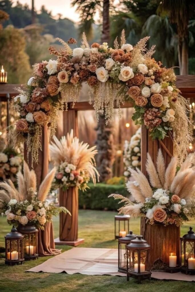
Copper and cream combine earthy warmth with soft, understated elegance. Copper introduces a reddish metallic tone, while cream keeps the palette light and inviting.
These wedding color palettes suit autumn celebrations, rustic barns, vineyard venues, and intimate receptions.
Use copper candleholders, cream linens, and floral arrangements featuring warm seasonal colors.
Copper-colored vases can become attractive centerpieces without requiring elaborate floral installations. Cream bridesmaid accessories or stationery can soften the deeper metallic details.
Wooden furniture and warm lighting also complement this combination beautifully. Couples can introduce terracotta or muted greenery for additional depth while maintaining the main color scheme.
The result feels welcoming, refined, and especially suitable for cooler months.
32. Lilac and Sage Green
Lilac and sage green create a soft combination inspired by flowers and fresh foliage. Lilac introduces a delicate purple tone, while sage adds natural depth and balance.
These wedding color palettes work beautifully for spring garden ceremonies, countryside celebrations, and romantic outdoor receptions.
Consider lilac bridesmaid dresses, sage napkins, and ivory flowers with green foliage. Simple glass vases can keep the floral arrangements looking fresh without adding unnecessary expense.
Couples can also introduce lilac stationery and sage ribbons for a consistent appearance. The colors complement each other naturally, so elaborate decorations are rarely necessary.
This combination feels gentle and graceful, making it ideal for couples who prefer a softer approach to wedding styling.
33. Black and Champagne
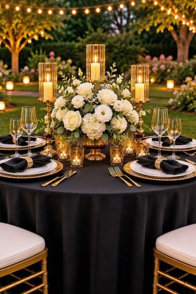
Black and champagne combine dramatic contrast with warm, elegant details. Black provides definition, while champagne softens the appearance with its subtle golden tone.
These wedding color palettes suit formal evening receptions, luxury hotels, and sophisticated indoor venues.
Choose black suits, champagne bridesmaid dresses, and ivory flowers for a balanced arrangement.
Black menus or napkins can introduce contrast across reception tables, while champagne candleholders provide warmth.
Couples can also incorporate crystal glassware or simple metallic stationery details. The key is allowing the darker shade to frame the lighter elements instead of dominating the entire venue.
This combination feels polished and dependable for celebrations with a formal dress code.
34. Raspberry and Ivory
Raspberry and ivory create a lively romantic combination that feels expressive without becoming overwhelming. Raspberry adds a rich pink-red tone, while ivory introduces softness and balance.
These wedding color palettes suit garden receptions, summer celebrations, and elegant venues with plenty of natural light.
Consider raspberry bouquets, ivory tablecloths, and bridesmaid dresses in a muted berry shade.
Raspberry napkins or stationery can connect the color scheme throughout the venue. Neutral suits and simple accessories help keep the stronger color from competing with other details.
Couples can also incorporate white roses and greenery to soften floral arrangements. This combination feels cheerful, memorable, and adaptable to both relaxed and formal wedding styles.
35. Caramel and Ivory
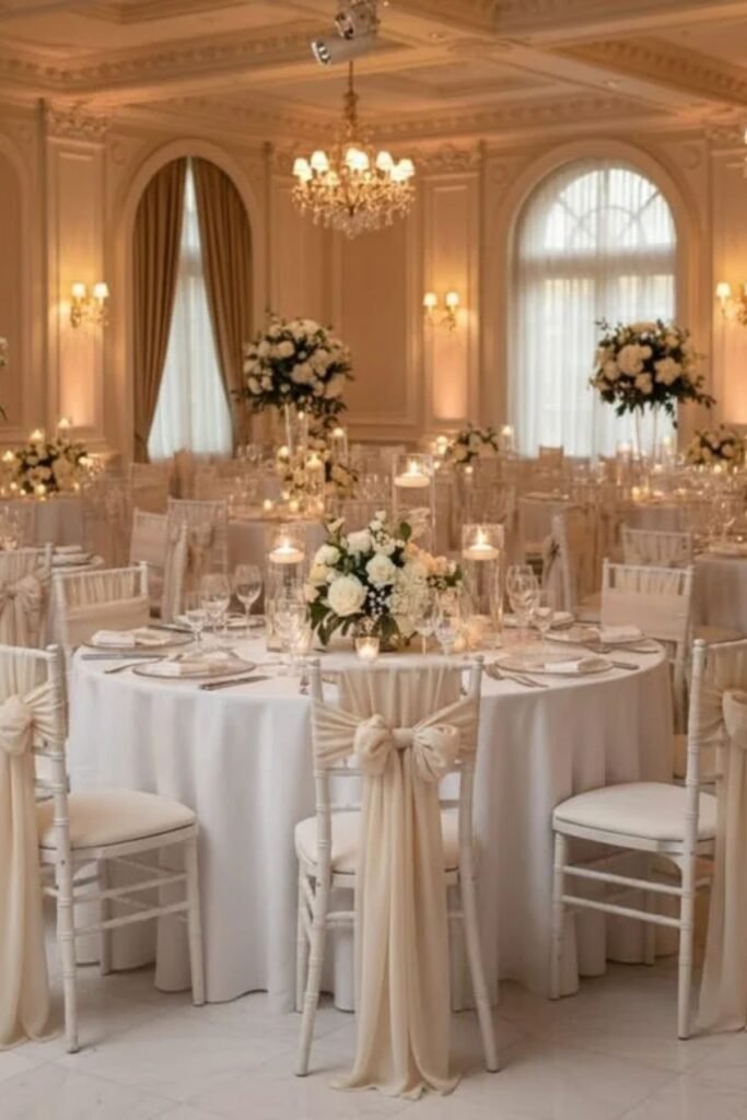
Caramel and ivory create a warm, inviting combination that feels classic and understated. Caramel introduces a rich golden-brown shade, while ivory keeps the overall appearance soft and elegant.
These wedding color palettes suit autumn celebrations, rustic venues, vineyard receptions, and intimate indoor gatherings.
Consider caramel bridesmaid dresses, ivory flowers, and cream-colored table linens.
Wooden chargers and simple ceramic vases can complement the palette without requiring expensive decorations.
Caramel ribbons or stationery can also connect the colors throughout the venue. Add greenery for a natural finish, or introduce champagne accents for a more formal appearance.
This combination works particularly well with warm lighting, creating a reception atmosphere that feels comfortable and beautifully coordinated.
36. Periwinkle and White
Periwinkle and white create a graceful combination that feels fresh, delicate, and timeless.
Periwinkle blends blue and purple undertones, giving the palette a gentle color that stands apart from traditional blue.
These wedding color palettes suit spring ceremonies, garden receptions, and elegant daytime celebrations.
Choose periwinkle bridesmaid dresses, white roses, and crisp white linens for a balanced design.
Periwinkle ribbons can decorate bouquets, while matching stationery creates consistency across wedding details. Silver accessories complement the cool tones without competing for attention.
Couples can introduce greenery to bring additional depth to floral arrangements.
This combination works particularly well in bright venues, where natural light helps the delicate shades appear fresh and inviting.
37. Wine Red and Champagne
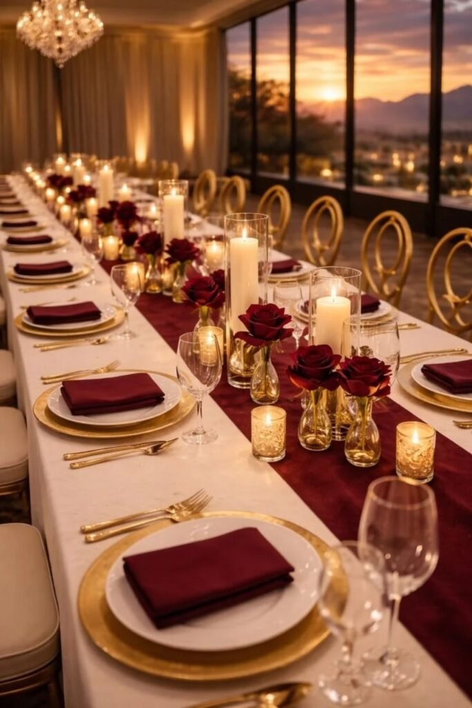
Wine red and champagne create a rich, romantic combination that feels sophisticated and enduring.
Wine red brings depth, while champagne adds warmth through its soft golden undertones.
These wedding color palettes suit autumn weddings, winter receptions, historic estates, and formal evening celebrations.
Consider wine-red bridesmaid dresses, champagne table linens, and ivory floral arrangements.
Champagne candleholders can soften the deeper shade, while wine-red stationery introduces a coordinated detail.
Gold accessories also complement the combination without requiring excessive decoration. Couples can use wine red sparingly in smaller venues, allowing champagne and ivory to keep the space bright.
38. Denim Blue and Cream
Denim blue and cream create a relaxed combination that feels welcoming without sacrificing elegance. Denim blue introduces a familiar, understated shade, while cream softens its appearance.
These wedding color palettes suit barn weddings, outdoor celebrations, casual receptions, and countryside venues.
Consider denim-blue bridesmaid dresses, cream tablecloths, and white flowers with greenery. Natural wood furniture and simple glass vases can strengthen the relaxed style.
Couples can also introduce denim blue through ribbons, napkins, or stationery rather than making it the dominant color. Cream-colored candles add warmth when the celebration moves into the evening.
This combination works particularly well for couples who want a comfortable atmosphere with coordinated details and minimal fuss.
39. Aubergine and Blush
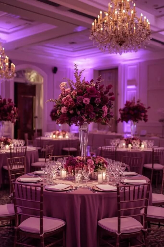
Aubergine and blush combine deep purple richness with delicate romantic softness. Aubergine creates a dramatic foundation, while blush prevents the palette from feeling too dark.
These wedding color palettes suit autumn ceremonies, historic venues, formal receptions, and elegant evening celebrations.
Choose aubergine bridesmaid dresses, blush roses, and ivory table linens. Blush stationery or napkins can soften the deeper shade throughout the reception space.
Gold candleholders introduce warmth, while greenery adds natural contrast to floral arrangements. Couples can keep aubergine as the main color and use blush for lighter details.
This approach creates visual balance while preserving the palette’s romantic character. It also works beautifully with candlelight and traditional venue decor.
40. Butter Yellow and Cream
Butter yellow and cream create a gentle, sunny combination that feels cheerful without becoming overly bright.
Butter yellow introduces warmth, while cream keeps the overall appearance soft and timeless.
These wedding color palettes suit spring garden ceremonies, summer receptions, and relaxed outdoor celebrations.
Consider butter-yellow flowers, cream linens, and delicate yellow ribbons on bouquets. Pale yellow bridesmaid dresses can complement neutral suits and understated accessories.
For reception tables, use cream candles and simple glass vases to keep the arrangement uncluttered.
Green foliage adds contrast while preserving the natural feeling.
This combination works especially well during daytime celebrations, creating a welcoming atmosphere that feels light, elegant, and effortlessly coordinated.
41. Slate Blue and Ivory
Slate blue and ivory create a refined combination with a calm, slightly muted appearance. Slate blue introduces depth without the intensity of navy, while ivory provides softness and contrast.
These wedding color palettes suit coastal venues, elegant hotels, garden receptions, and traditional ceremonies.
Choose slate-blue bridesmaid dresses, ivory bouquets, and cream-colored table linens. Slate-blue stationery can connect the palette throughout invitations, menus, and place cards.
Silver accessories complement the cool undertones, while candles introduce warmth during evening receptions.
Couples can also combine slate blue with natural greenery for a softer outdoor appearance.
This versatile pairing works across multiple seasons and remains elegant without depending on elaborate decorative details.
42. Maroon and Blush Pink
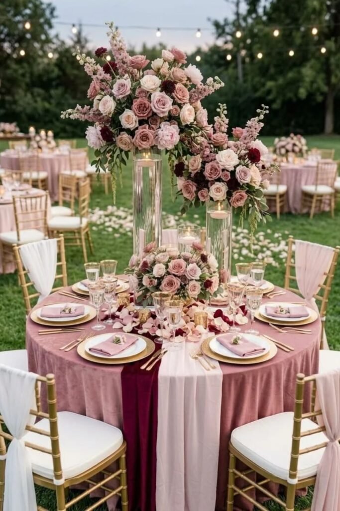
Maroon and blush pink balance deep romantic color with a delicate, gentle shade. Maroon introduces richness, while blush adds brightness and softness.
These wedding color palettes suit autumn receptions, winter ceremonies, traditional venues, and elegant evening celebrations.
Consider maroon bridesmaid dresses, blush floral arrangements, and ivory table linens. Blush roses can soften the darker color, while maroon napkins create continuity across reception tables.
Gold candleholders or champagne accessories introduce additional warmth without overpowering the palette.
Couples can also use maroon in their invitations and ceremony flowers for a coordinated appearance.
This combination feels romantic and classic, especially in venues with warm lighting, wooden furniture, or traditional architectural details.
43. Aqua and White
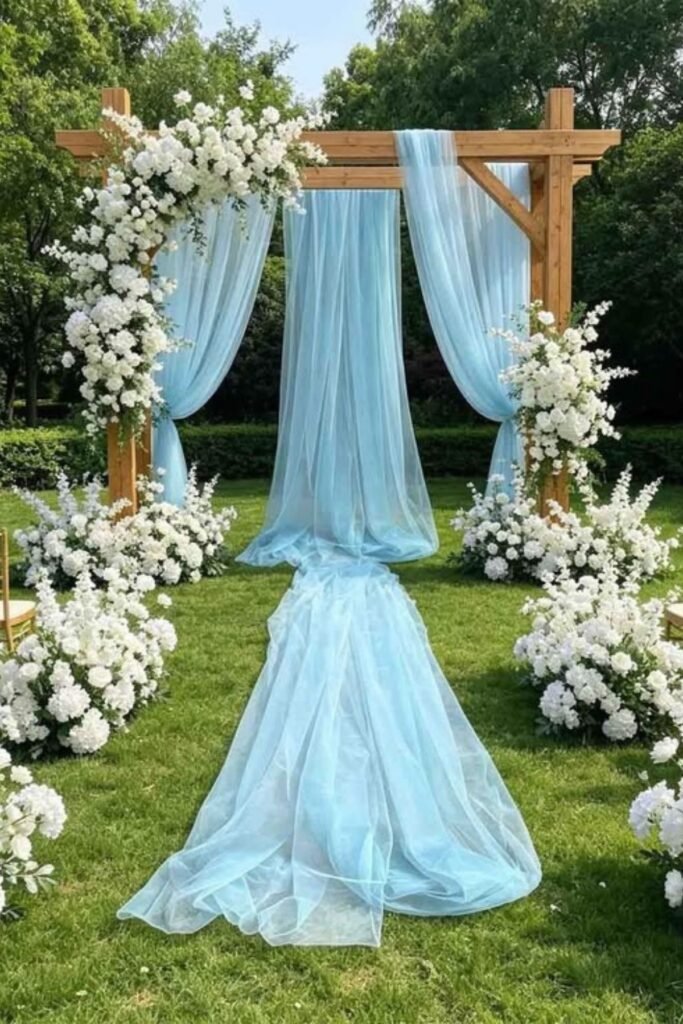
Aqua and white create a bright combination inspired by clear water and sunny coastal settings. Aqua introduces a refreshing blue-green tone, while white keeps the overall appearance clean and airy.
These wedding color palettes suit beach ceremonies, summer garden receptions, and relaxed destination celebrations.
Choose aqua bridesmaid dresses, white flowers, and crisp white table linens. Clear glass vases and subtle aqua glassware can introduce color without cluttering reception tables.
Couples can also use aqua ribbons, menus, or place cards for simple decorative details. Natural greenery complements the combination, while sandy neutrals can soften its brightness.
This palette works especially well outdoors, where sunlight helps the colors feel fresh and inviting.
44. Cinnamon and Cream
Cinnamon and cream create an earthy, warm combination with a classic appearance. Cinnamon introduces a reddish-brown tone, while cream softens the palette and adds brightness.
These wedding color palettes suit autumn celebrations, rustic barns, vineyard venues, and intimate countryside receptions.
Consider cinnamon bridesmaid dresses, cream flowers, and neutral table linens. Wooden chairs and ceramic vases can complement the earthy tones without adding unnecessary expense.
Cinnamon napkins or ribbons provide simple ways to repeat the color throughout the celebration.
Couples can introduce muted greenery for additional contrast, while gold details create a slightly more formal finish.
This combination feels especially inviting during cooler months and works beautifully with seasonal floral arrangements.
45. Pale Pink and Gold
Pale pink and gold create a romantic combination that feels elegant, warm, and enduring. Pale pink provides a delicate foundation, while gold introduces subtle brightness through metallic details.
These wedding color palettes suit garden ceremonies, ballroom receptions, and celebrations with soft romantic styling.
Choose pale pink roses, gold candleholders, and ivory table linens. Pink bridesmaid dresses can complement gold jewelry and understated bouquets.
For stationery, consider pale pink backgrounds with restrained gold lettering or borders.
Couples should balance metallic details with natural flowers and soft fabrics, keeping the appearance elegant rather than overly shiny.
This combination works throughout the year, especially when seasonal flowers and fabrics reflect the wedding’s setting.
46. Pine Green and Gold
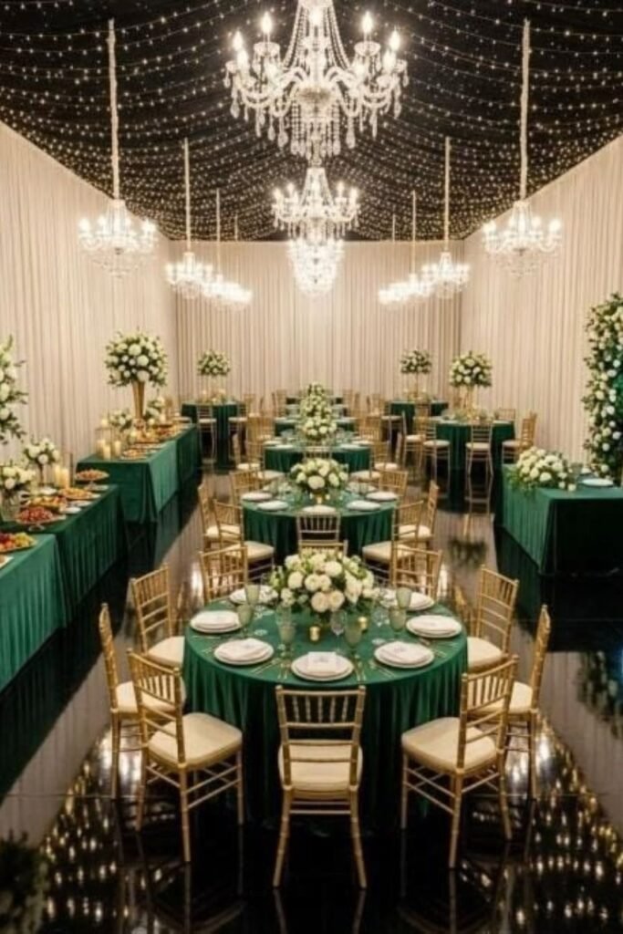
Pine green and gold create a rich combination inspired by evergreen foliage and warm metallic accents. Pine green brings depth, while gold introduces brightness and elegance.
These wedding color palettes suit winter celebrations, formal receptions, historic estates, and sophisticated indoor venues.
Consider pine-green bridesmaid dresses, gold candleholders, and ivory floral arrangements.
Green table runners can introduce the main color, while gold details highlight place settings and reception decorations. White flowers help balance the deeper shade, especially in smaller venues.
Couples can also use simple foliage arrangements instead of expensive floral installations.
This combination feels particularly appropriate during winter, although lighter fabrics and fresh flowers make it suitable for other seasons.
47. Mauve and Champagne
Mauve and champagne create a graceful combination with soft color and understated warmth. Mauve introduces a muted pink-purple tone, while champagne adds a gentle golden glow.
These wedding color palettes suit garden weddings, elegant estates, and intimate receptions with romantic styling.
Choose mauve bridesmaid dresses, champagne linens, and ivory flowers for a coordinated appearance.
Champagne candleholders can add warmth, while mauve stationery ties the colors together. Gold accessories complement the palette without overwhelming its delicate character.
Couples can also incorporate soft greenery to provide contrast across floral arrangements.
This combination works beautifully during spring and autumn, although candlelight and richer fabrics make it appealing during winter celebrations.
48. Rust and Ivory
Rust and ivory create an earthy combination that feels warm, distinctive, and timeless. Rust brings a deep reddish-orange tone, while ivory introduces softness and balance.
These wedding color palettes suit autumn weddings, desert venues, rustic barns, and outdoor celebrations surrounded by natural scenery.
Consider rust bridesmaid dresses, ivory bouquets, and cream-colored table linens. Dried flowers and ceramic vases can complement the earthy tones while keeping decorations practical.
Wooden chairs and subtle gold accessories also work beautifully with this palette. Couples can introduce rust through napkins, ribbons, and stationery instead of using the color everywhere.
This combination creates a welcoming atmosphere that feels especially appropriate for late summer and autumn celebrations.
49. Blue and Gold
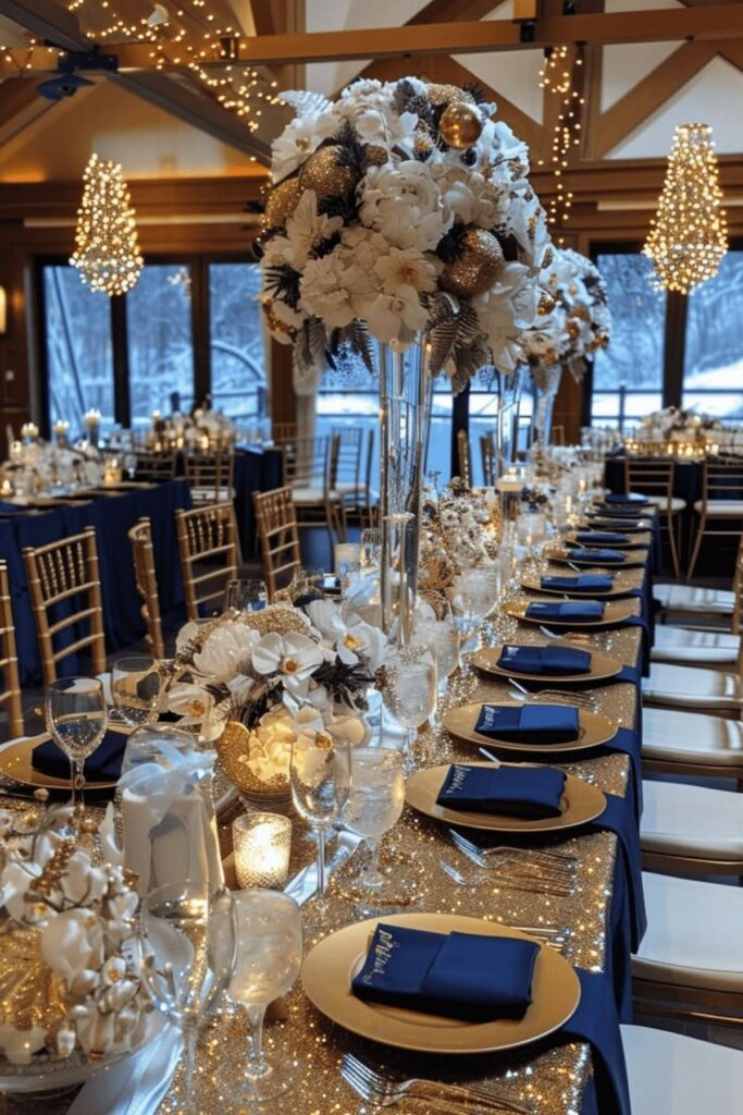
Blue and gold create a classic combination that balances cool color with warm metallic details. Blue provides a versatile foundation, while gold introduces brightness and sophistication.
These wedding color palettes suit formal receptions, traditional ceremonies, and modern celebrations with elegant styling.
Choose navy or royal-blue bridesmaid dresses, gold candleholders, and ivory floral arrangements.
Blue table runners can introduce color, while gold stationery details connect the theme throughout the reception.
Couples can adjust the blue shade to match their venue, choosing pale blue for daytime weddings or deeper tones for evening celebrations.
Keep gold accents restrained so the combination remains balanced. This pairing works across seasons and adapts easily to different wedding styles.
50. Ivory, Greenery, and Natural Wood
Ivory, greenery, and natural wood create a timeless combination inspired by simple, organic beauty.
Ivory provides a soft neutral foundation, greenery introduces freshness, and wood adds warmth through natural texture.
These wedding color palettes suit garden ceremonies, barns, outdoor receptions, and intimate countryside celebrations.
Consider ivory roses, eucalyptus garlands, wooden tables, and simple glass candleholders. Greenery can decorate ceremony arches or reception tables without requiring elaborate floral installations.
Natural wood chairs and understated linens help create a welcoming atmosphere.
Couples can introduce small gold accents for additional polish, although the combination looks beautiful without them.
This palette works throughout the year and offers flexibility for different budgets, venues, and seasonal flowers.
For more inspiration, explore The Knot’s wedding color ideas.